More and more businesses in APAC are adopting data analytics solutions to benefit from the ever-growing data volume. According to IDC, the region’s market for this technology is likely to hit $27 billion by 2020, at a CAGR of 15.1%. What’s even more surprising is that China, Vietnam, Australia, and the Philippines will see the fastest adoption rate of data analytics solutions. Aside from storing and processing data, data analytics solutions also helps with data visualization and predictive analytics when empowered with AI/ML algorithms.
In this article, let’s look at the top 11 solutions for data and analytics, their key features, as well as the pros and cons of each solution.
What are the best data analytics solutions for companies in APAC?
- Vertica
- Tableau
- Qlik Sense
- Power BI
- GoodData
- Birst by Infor
- Domo Analytics
- SAP Analytics Cloud
- IBM Cognos Analytics
- Sisense
- Zoho Analytics
Vertica
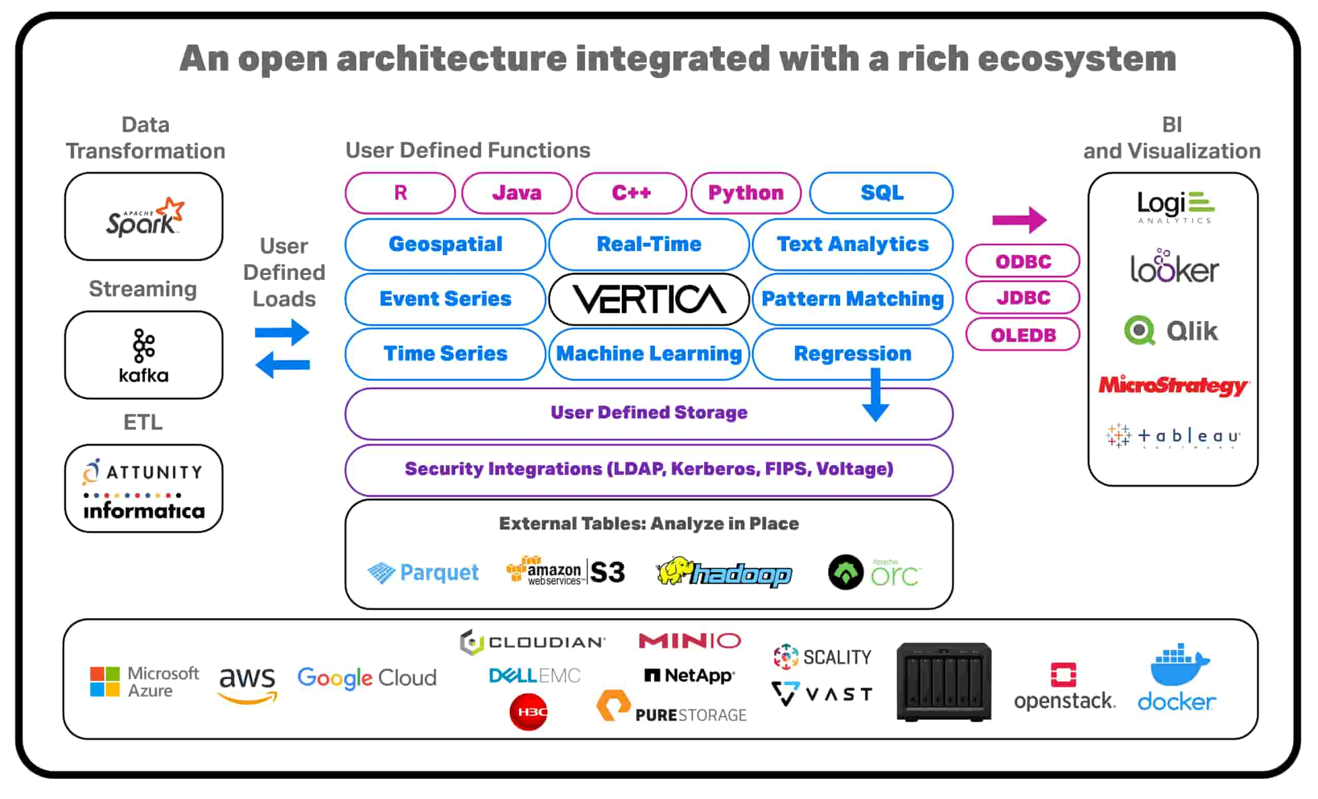
Vertica is a leading analytics data warehouse built for the scale and complexity of today’s data-driven world. It has all the normal concurrency capabilities you expect from a good analytical database, but at big data scale. Vertica includes the power of a high-performance, MPP query engine with advanced analytics and machine learning.
Customers that utilize Vertica are able to do analytics with the security of SLAs, have a great deal of leeway in tuning performance, deploy Vertica in their chosen model, predict the cost of running a query and leverage existing skillset and further optimize it.
Vertica Unified Analytics Platform enable users to get data quickly enough to act on it, explore your data interactively, and enable everyone to make their own data-driven decisions. Its in-database machine learning supports the entire predictive analytics process with massively parallel processing and a familiar SQL interface, allowing data scientists and analysts to embrace the power of Big Data and accelerate business outcomes with no limits and no compromises.
Key features:
Tableau
Tableau Online is exclusively for data visualization. And it’s the leader in this visualization niche. Most of its features are all about creating stunning and friendly dashboards. Using Tableau, you find it easy and intuitive to adjust the dashboards in ways that fit your industry’s or department’s purposes. And this is not to say that Tableau has excellent mobile optimization. It can recognize what device you are using and adjust its dashboards and interface accordingly.
The range of visualizations Tableau offers is simply unequaled. You will find all the basics such as bar chart, line chart, and pie chart. The advanced ones include Gant chart, box plot, and many more.
For all that, Tableau is purely a data viz tool, not to confuse it with an end-to-end data analytics solution. Most often, Tableau works best for one-off/throw-away projects by individual users or workgroups who want to create pretty dashboards. So if all that you are looking for is beautiful visualization, Tableau is the one.
Another issue with Tableau is its pricing. It’s notorious for its expensive charges, increasingly so when you scale Tableau for all users across your company.
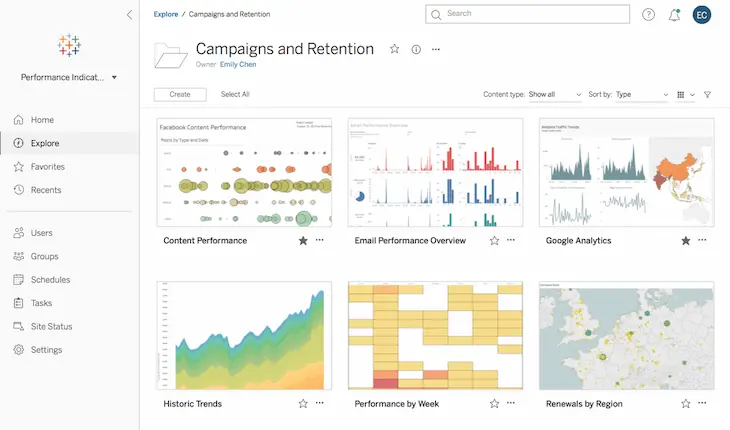
Tableau’s interface. Source: Tableau
Key features:
Qlik Sense
Qlik Sense provides rich features for both data visualization and data analysis. You can access this data analytics solution via desktop or web browser.
A unique feature of Qlik Sense is the Associative Engine. It is capable of combining and indexing a large number of data sources in-memory. What’s so cool about the Associative Engine is that it lets you highlight every possible association between data simply by dragging-and-dropping.
Qlik Sense supports advanced integration, able to work well with popular applications and data sources such as Google Big Query, SAP NetWeaver, Hadoop, and Salesforce.com.
Yet, Qlik’s customization is rather poor. Most likely, you will lean to IT if you want to customize your dashboards or visual content. Another shortcoming is that storing data in-memory as Qilik does will create data silos. You are required to duplicate their data and logic to perform data prep. This results in unnecessary, confusing copies of data and logic.
The Qlik Sense’s free trial lasts for 30 days, enough for you to decide whether it’s right for your team or not. After that, you can think about paying $30 each month for each user.
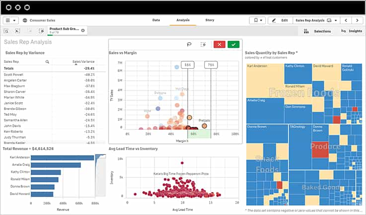
Qlik Sense’ interface. Source: Qlik
Key features:
✔ Associative engine: Linking sources of data together to understand the associations between them.
✔ Qlik Management Console: Managing all services and properties offered by Qlik Sense. You can find four key sections on Qlik Management Console: manage content, manage resources, governance, and configure systems.
✔ Qlik Datamarket: A large library that offers ready access to external sources of data. With Qlik Datamarket integrated into QlikSense, you can easily enrich your in-house data with trusted data coming from the outside of your organization.
Power BI by Microsoft
Power BI hosts a number of business intelligence and visualization tools. Power BI is powerful in that it lets users connect and prep data from disparate sources to build reports, dashboards, and apps. It is now supporting more than 20 types of visuals.
Developed by the mighty Microsoft, Power BI integrates perfectly with Office 365, Microsoft Excel, and Azure. If you are a Microsoft fan, you will find Power BI’s interface familiar. It shares the same theme with those of Office 365 tools, such as Word, Excel, or PowerPoint that you use every day.
However, the great strength of Power BI comes with its great complexity. Because it offers too many options to handle data, Power BI may appear overwhelming for many users. The customization of reports is no less demanding as Power BI requires an understanding of SQL.
There are three versions of Power BI. Power BI Desktop (free and deployed on desktop), Power BI Pro (charged on a per-user basis), and Power BI Premium (for enterprise and without per-user licenses).
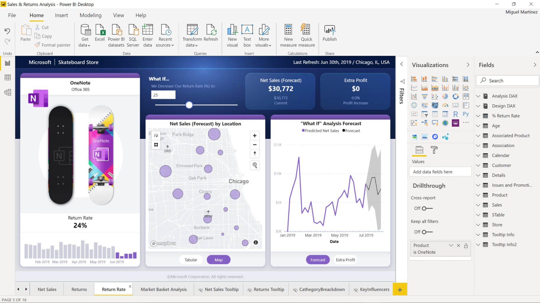
Power BI’s interface. Source: Power BI
Key Features:
✔ Get Data: selecting data from a wide array of data sources. Power BI supports data selection both from on-premises or cloud-based, both unstructured and structured.
✔ DAX functions: performing a variety of actions on the data. DAX is a formula language used in Power BI, allowing users to build calculations on their tables and fields.
✔ Q&A Question Box: Making inquiries about data, information, or visualizations available in Power BI with natural language. This cognitive feature use autofilling, rephrasing, and suggestions to meet users’ search requirements.
GoodData Platform
GoodData delivers embedded analytics. It lets you incorporate advanced analytics into your applications without having to call on IT experts. The embedded capabilities include data visualizations, self-service analysis, ad-hoc reporting, predictive analytics, visual discovery, and many more.
GoodData is “invisible”. Once embedded, this analytics tool becomes a part of your day-to-day workflows, providing all self-service features you need to perform analytics like a real data scientist. And yet you barely recognize that GoodData is there.
GoodData turns data into recommended actions and delivers personalized insights to reduce the gap between analysis and action. The robust digital applications integration capabilities ensure that the insights are displayed seamlessly right within the business applications you already use.
Whether it’s for the analytics of Sales, Marketing, Operations, Product, or HR, GoodData displays everything you need on one single interface so that you can intuitively dive into the numbers.
GoodData is free to start, simple to use, and costs a whole lot less than building a platform from scratch. This is because, with GoodData, companies find there’s no need to hire new BI experts, to upgrade infrastructure, or maintain a platform that is able to scale with demand.
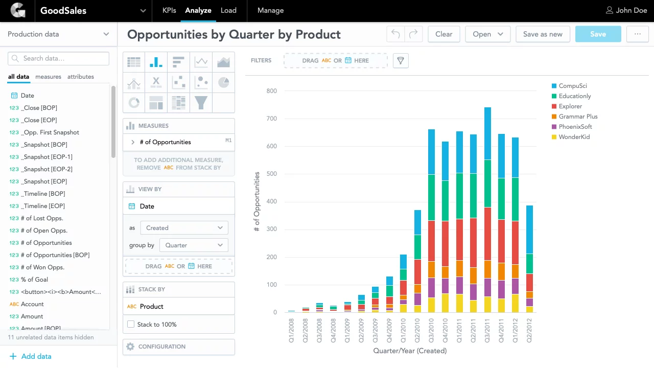
GoodData’s interface. Source: GoodData
Key Features:
✔ Data Integration: Integrating seamlessly with popular data warehouses (Snowflake, Redshift, and BigQuery) and infrastructure thanks to GoodData’s robust and flexible data integration, which is optimized for the latest analytical solutions and technologies.
✔ Open Platform for Developers: Integrating with your existing development, data, and UI stack by leveraging a rich set of APIs and development frameworks.
✔ Enterprise-Grade Security and Control: Focusing on core business instead of managing the components and costs needed to support analytical solutions with an end-to-end managed service, including the runtime, the operation, security, and the management of the platform.
At KMS Solutions, we provide GoodData’s licenses along with implementation and support services. See how we can help you empower everyone in your business with an easy-to-use yet powerful data analytics platform.
KMS Solutions also has been recognized as one of Top Big Data Companies by DesignRush.
Birst by Infor
Birst can serve whatever needs you may have for reporting and analytics. Its comprehensive functionalities include advanced visualization, dashboards, pixel-perfect reporting, and self-service data prep. According to Gartner, 61% of Birst’s customers use it as their only analytics and Business Intelligence (BI) tool.
If you no longer want to rely on IT for BI and various types of data analytics, Birst can help. Its semantic layer allows non-technical users to create custom measures and attributes by using common business terms while ensuring a unified version of analytics across the business.
Birst can also cut hours wasted on data transfer. It offers live access connection to data warehouses so that users don’t have to import data to Birst. If there’s no existing data warehouse to connect to, Birst’s automated data prep quickly builds data warehouses with the semantic layer. This feature accelerates the traditional ETL process and metadata creation.
Birst is a multi-tenant BI platform, so its pricing is subscription-based. This means users only have to pay for what they need, and when they need it. Once the subscription starts, Birst manages all the infrastructure necessary for it to run. Any upgrades are automatically added to the version in use. There’s no need for any more contracts. Companies using Birst are freed from the hardware and setup costs, with little to no IT resources involved. And Birst can get up and running in a few weeks, rather than months like traditional BI.
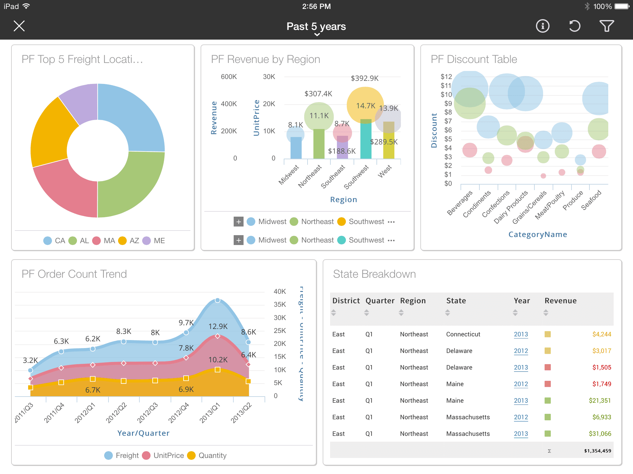 Birst’s interface. Source: Birst
Key Features:
✔ Automated Data Refinement: Automating the integration of data from a vast amount of sources. Users will have access to a single version of enterprise-wide data.
✔ Multi-tenant Cloud Architecture: Connecting every Birst’s users via an analytics network.
✔ Embedded Analytics: Smoothly embedding Birst’s analytics capabilities into your existing applications.
Domo Analytics
Domo may be the runner-up in the visualization space, following Tableau. Its dashboard carries insights both informatively and visually, providing creative visualizations such as multi-part widgets, sparklines, and trend indicators.
Build on the Cloud, Domo delivers an analytics hub from which everyone can access and perform self-service data analytics. It connects the people, the data, and systems so that business users – even without a technical background – can make faster and better decisions.
Domo is able to connect data with more than 5 hundreds of pre-built connectors. However, it’s expensive and offers NO option for on-premises deployment.
Unfortunately, Domo falls short when it comes to enterprise-wide deployment. It has limited administration for IT and limited analytics for analysts. Gartner has shown that only 20% of Domo’s reference customers use it as their sole enterprise data analytics and BI platform standard.
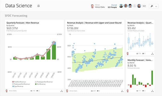
Domo’s interface. Source: Domo
Key features:
✔ Collaboration tool Buzz: Sharing charts or any kinds of visualizations across teams and discussing them through any devices.
✔ Workbench: importing on-premises data (from XML, ODBL, Excel, and more) into Domo. However, this feature creates unnecessary data silos.
✔ 1-click Apps: Leveraging hundreds of pre-built connectors to load data with just one mouse click.
SAP Analytics Cloud
SAP Analytics Cloud positions itself as a solution for all analytics and all users. It is built on the powerful SAP Cloud Platform, making it able to bring business planning, predictive analytics, digital boardroom, and advanced reporting into one single analytics suite. The capabilities it offers include data discovery, ad hoc reports, planning & forecasting, predictive analytics, and KPI monitoring.
Users can combine multiple data sources (such as Microsoft SQL or Salesforce) and data formats (texts, numbers, or special characters) into one single host.
In fact, SAP Analytics Cloud is an analytics platform mixed with EPM capabilities. It may appear a multi-purpose data analytics solution at first sight, but SAP Analytics Cloud can make you pay for features you don’t need or never use.
Users who first pick up SAP Analytics Cloud will find it dull and difficult to master. The interface crammed with tools and modules may very well frustrate most first-time users. But once you get used to SAP Analytics Cloud, it’s a powerful tool on the whole.
Most companies choose SAP for analytics and BI because most of their remaining applications are standardized around SAP.
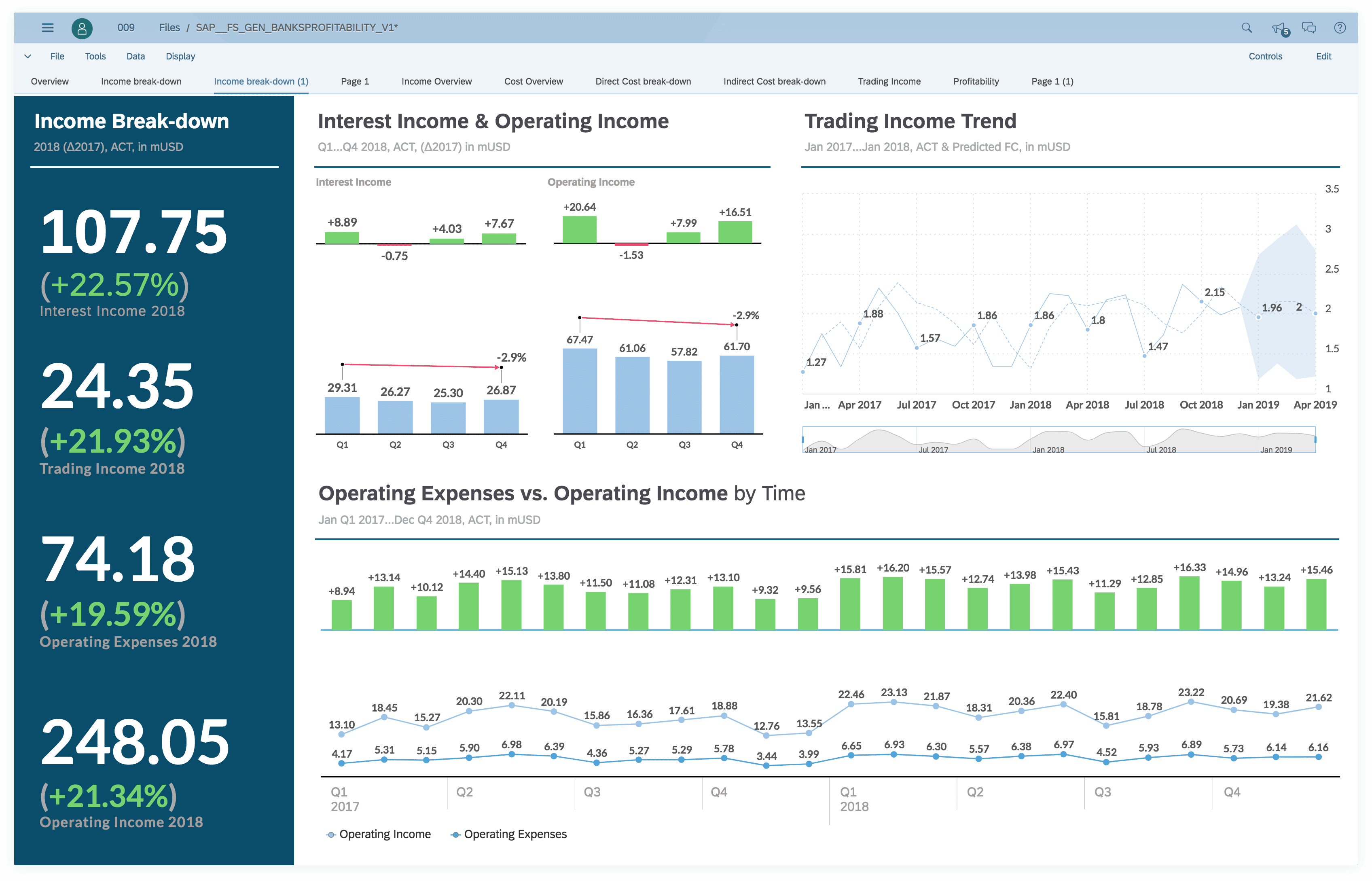
SAP Analytics Cloud’s Interface. Source: SAP
Key Features:
✔ Digital Boardroom: receiving real-time contextual information and ad-hoc analysis that can be shared throughout the organization, creating a single source of truth.
✔ Integrated Workflow: Facilitating the workflow of most departments such as Finance, Marketing, Sales, Operations, or Human Resources from a single platform
✔ Advanced Integration: Connecting to data sources from external systems like Microsoft Office, Salesforce, and so one, and use their data to perform analysis and visualization.
IBM Cognos Analytics by IBM
IBM Cognos Analytics is the upgraded version of IBM Business Intelligence with additional capabilities such as cognitive support, web interface, and advanced visualizations.
IBM Cognos Analytics is completely self-service. It is designed for virtually anyone. Though, people who have used IBM Cognos Analytics referred to it as ideal for finance and accounting.
Like other tools, IBM Cognos Analytics can load data from a variety of data sources, analyze, and build reports and dashboards that can be shared throughout the organizations. Users can choose to deploy IBM Cognos Analytics on-premises or on the Cloud, and sometimes both.
IBM Cognos Analytics has a steep learning curve. The tool is tough to get used to and there are only a few guidebooks or resources available. Other than that, IBM Cognos provides plenty of powerful features for data analytics, which can justify its complexity.
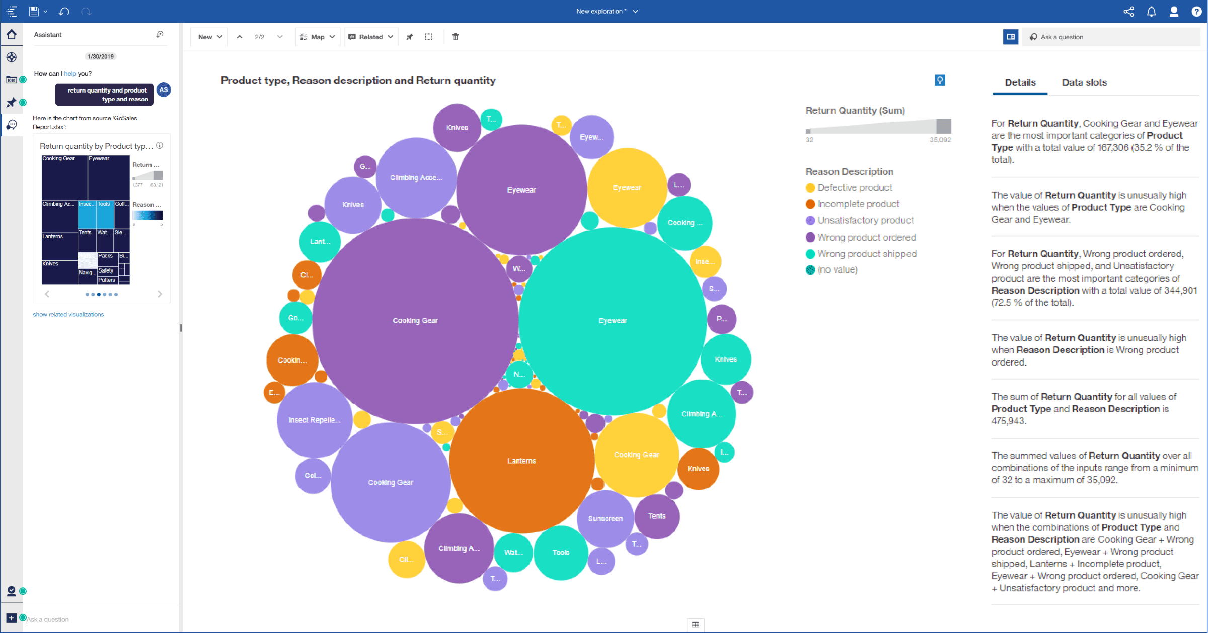
IBM Cognos Analytics’ interface. Source: IBM
Key Features:
✔ Query Studio: keying in simple queries to request reports such as charts and graphs.
✔ Web-based experience: experiencing the same user interface whether IBM Cognos Analytics is used on desktops or mobile devices. The tool being 100% cloud-based spares users the trouble of transferring data from their proprietary data warehouse.
✔ Robust Automation: saving time and increasing productivity because IBM Cognos Analytics automates analysis and generates recommendations based on users’ past behaviors.
Sisense
Sisense is one of the most powerful data analytics tools there is.
With ElasticCubes – Sisense’s proprietary analytical database, you can capture datasets from a rich variety of sources, and then perform analysis on those datasets as if they are just one dataset. ElastiCubes frees you from creating OLAP cubes or data marts. Sisense claimed that this feature could process terabytes of data in seconds.
Sisense’s in-chip analytics makes it faster to perform analytics. In-chip is the alternative to the slow in-memory that many big analytics players, such as Qlik or Tableau, still rely on.
However, Sisense requires technical skills to prepare data and create ElastiCubes so that end-users could build dashboards. In this sense, Sisense is designed for developers, rather than business people. Its reference user also reported having a hard time upgrading and maintaining the tool.
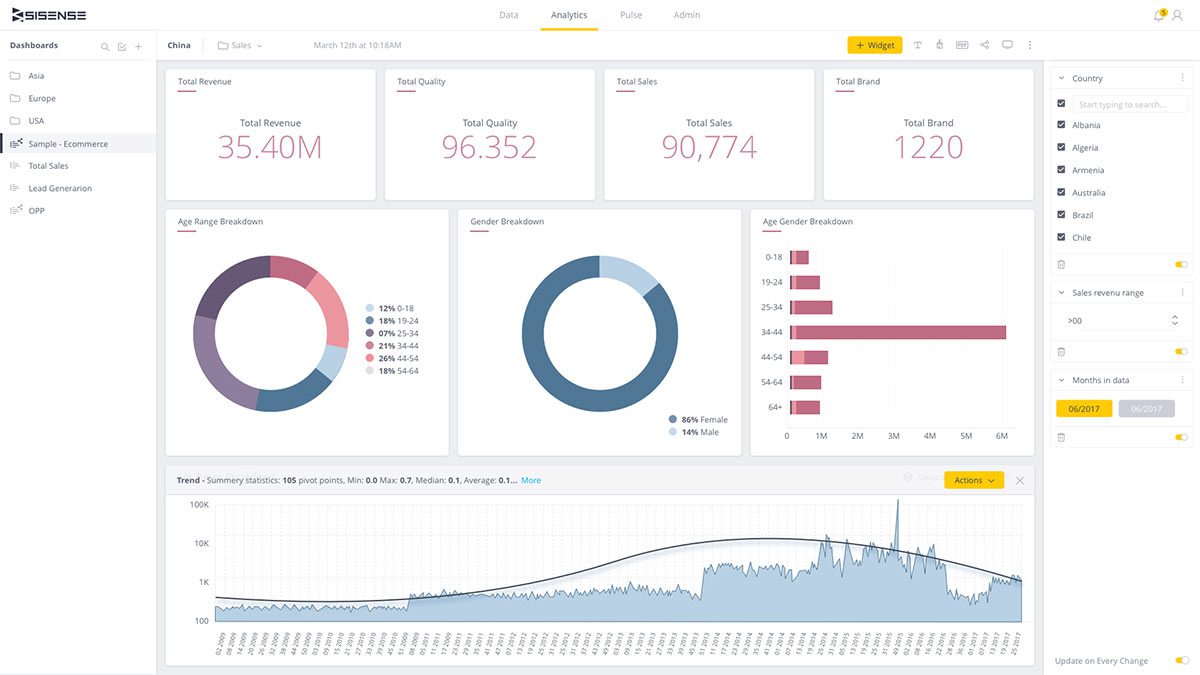 Sisense’s interface. Source: Sisense
Key features:
✔ Visual Analytics: interacting with data and drilling down into dashboards to find insights with simple point-and-click.
✔ Data Wrangling: identifying outliers, inconsistencies, and deficiencies in data with intelligent data prep.
✔ Predictive Analytics: Using built-in predictive analytics to get started with data classification, clustering, and forecasting.
Zoho Analytics
Affordable pricing is one reason why many businesses go for Zoho Analytics. The price for each of its versions varies, but when compared to other analytics products, Zoho offers much lower prices. Aside from the trial version that is free, the basic package starts from 25$ per year.
Because Zoho Analytics is a new-comer in the data analytics solution space, there will be more features updated. This can either be a good or bad thing, depending on how you see it.
Zoho Analytics goes with Zia, a built-in analytics assistant. It uses advanced machine learning and natural language processing to understand users’ questions and give them instant answers in the form of relevant information, data, or reports.
If you are currently using other applications by Zoho like Zoho Desk, Zoho Analytics is recommended because of the solid integration with such tools.
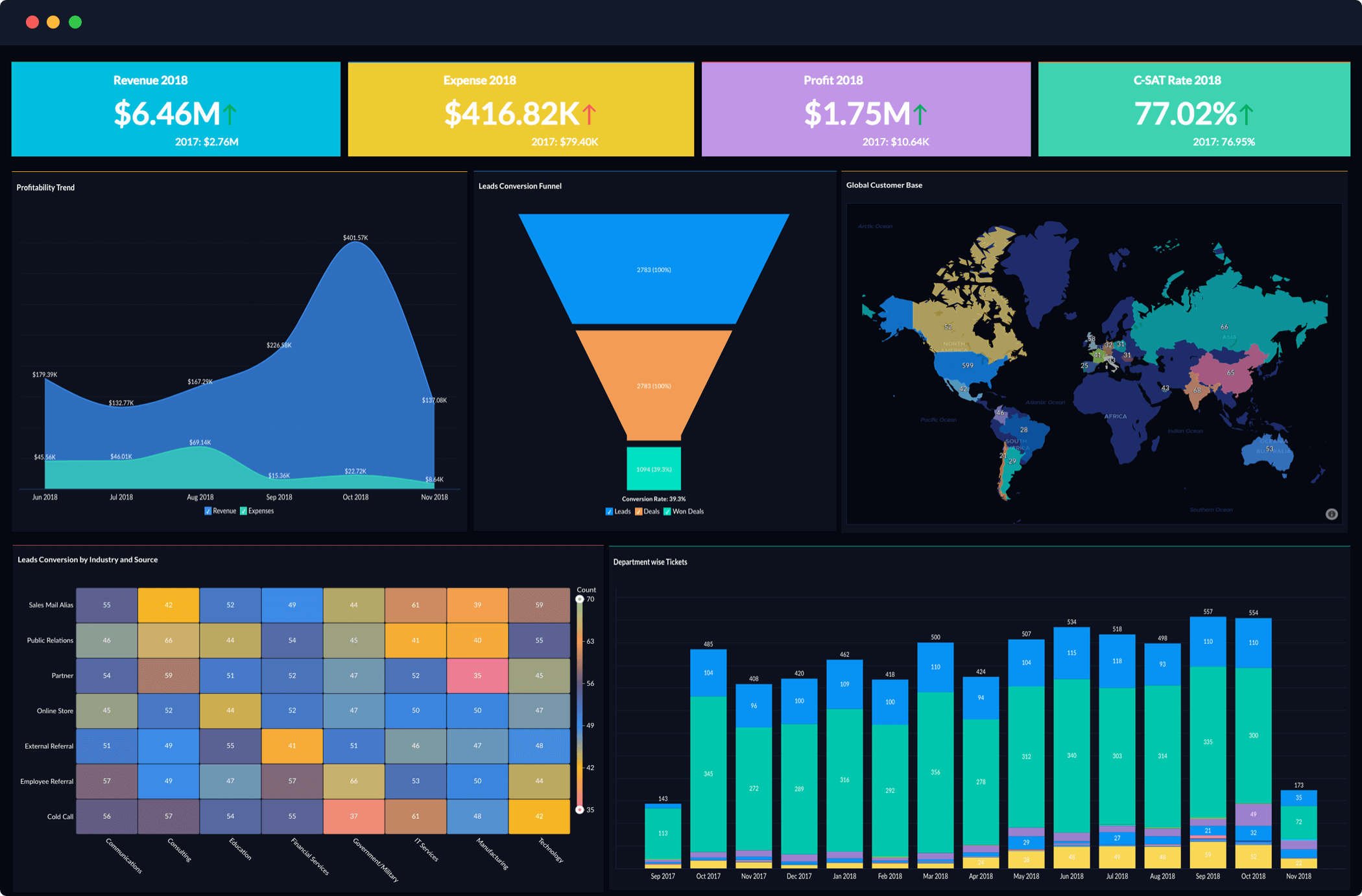
Zoho Analytics’ interface. Source: Zoho Analytics
Key Features:
✔ Advanced Reporting: Loading and merging data from the Cloud or data warehouse to build sophisticated reports on-demand. Users can share reports and schedule e-mail notifications to other users.
✔ Powerful Integration: Integrating Zoho Analytics with applications under Zoho or other popular applications such as Google Analytics, Zendesk, Salesforce CRM.
✔ Virtual Assistant Zia: Searching for data and reports available, or building new visualizations by querying simple language.
Want to learn more about how data analytics solutions can help you APAC businesses? Connect us now!


