The way businesses perform data analytics today is very different from the past. Gone are the days when executives have to strain their eyes to read spreadsheets of columns of data.
Now you want to turn data into meaningful charts and graphs that anyone can understand at one glance. This process is widely known as data visualization.
This 5-minute read will give you a general overview of data visualization: what data visualization is, why it matters, and the different types of data visualizations.
Table of contents:
2. Data visualization is how you should present your data
3. The 07 types of data visualizations
4. Benefits of data visualizations
5. Data visualization with specialized tools
Data visualization is data expressed in visual forms.
Think of those visual graphics, such as charts and graphs, that you see in most reports today, or in modern data analytics platforms.
You also can use the term data visualization to discuss the process of turning data into visual elements. Dozens of tools and software can support the data visualization process. For example, most BI and analytics tools have features for data visualization. Even traditional spreadsheets like Excel can set up certain types of charts.
Whether it’s in business or any other domains, data visualization makes it easier for you to discover patterns, trends, and anomalies within unprocessed datasets.
In other words, data visualization is a way for you to understand your data.
Data visualization is how you should present data
Just think about it. Which one would look easier on the eyes (if not to the brain): Data presented as visual dashboards or data as thousands of spreadsheet columns?
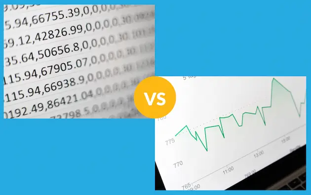
Which one is more consumable, data spreadsheet or data visualization?
Humans, by very nature, prefer visual content (i.e., images) more than textual content or numerical content. According to a study by SH!FT Disruptive Learning, human beings process images 60,000 times faster than they do with tables or texts. This study also revealed that images stay in our memory longer.
What’s more? Presenting the same data set, graphs usually require less space than tables. This anyone who ever makes reports can say for sure.
All this showed that data visualization is easier to understand, to remember, and to present.
Therefore, data visualization is one of the most effective ways to interpret data and to communicate it to your co-workers, your bosses, or stakeholders.As the statistician Edward Tufte noted: “Graphical excellence is that which gives to the viewer the greatest number of ideas in the shortest time with the least ink in the smallest space.”
The 7 common types of data visualizations
Let’s now look at some common data visualizations and what uses they have:
1. Bar chart
The bar chart (or bar graph) is perhaps the most popular type of data visualization. You should use bar charts wherever you want to describe how data changes over a period, to compare different categories, or compare different parts of a whole.
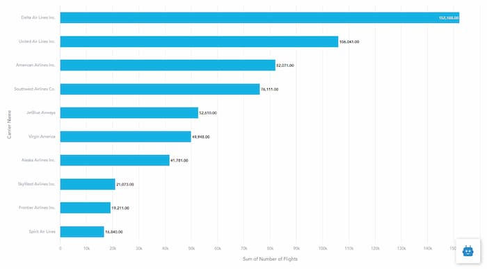
A bar chart
2. Pie chart
A pie chart resembles a circle that is cut into slices. Each of these slices stands for a portion of the total. People often use pie charts to compare parts of a whole.
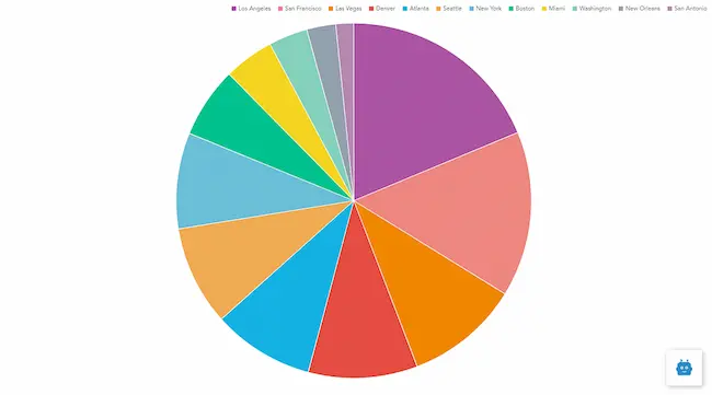
A pie chart
3. Line charts
A line chart is what you want to show how data changes — in other words, how data trends upwards and/or downwards — over time. This type of data visualization describes relationships, acceleration, deceleration, and volatility.
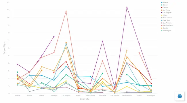
A line chart
4. Scatter plot
Scatter plots represent the relationships between items based on two variables. They are useful for showing how data groups are correlated with each other.
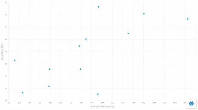
A scatter plot
5. Heat map
Heatmaps use the intensity of color to represent the values of geographical areas or data tables. The intensity of color shows how data of one category is different from the data of another.
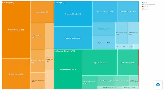
A heat map
6. Bubble charts
Bubble chart is one version of the scatter plot. In this data visualization, bubbles — instead of dots — represent data points. The bubble’s color and size can be used to represent other data dimensions or data values.
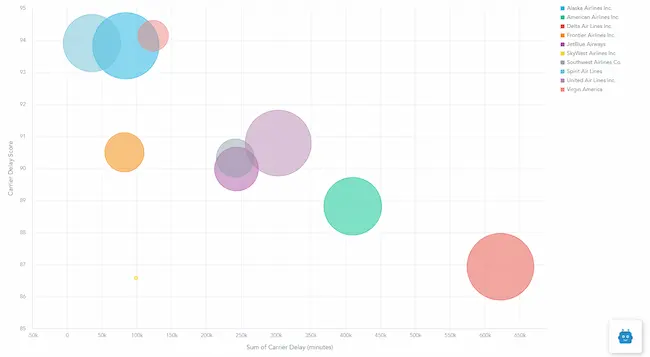
A bubble chart
7. Area charts
Area charts describe the relationship of series over time, similar to line charts. However, area charts can also depict data volumes.
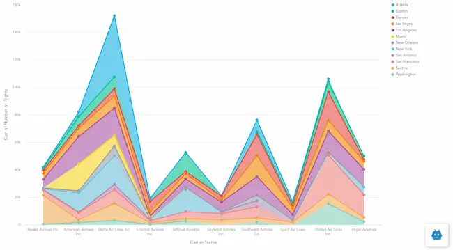
An area chart
The benefits of data visualization
By rendering data sets into different forms of visualizations, you can look at them from different perspectives.
Deliver insights that last: As clearly shown, visuals enter our memory easier, and stay there longer. Your co-workers, bosses, and clients will thank you when you use clearly-designed data dashboards to communicate data, such as your figures, rather than not a spreadsheet file crammed with numbers. “A picture is worth a thousand words” -this old saw perfectly captures how valuable data visualization is.
Create a big picture of the whole context: There’s no way you can absorb thousands of data columns all at once. This is where data visualization becomes helpful. Now you don’t have to strain your eyes to read lines and lines of tables. With data visualization, you can easily see the whole picture at one glance. “There is magic in graphs. The profile of a curve reveals in a flash a whole situation”, observed Henry D. Hubbard.
Improve decision-making: From data visualizations, you can easily draw conclusions and know what to do next. This is because you can spend less time mulling over spreadsheets. And, as data becomes more understandable, there’s no need for data scientists. Data visualizations allow you to make faster evaluations, updates, and decisions.
Facilitate the distribution of data and data insights: Data and the insights from it are only useful when they are communicated effectively. It used to be that only IT people can understand data, and perform data visualization. Now thanks to data visualization, any departments — be it sales, finance, sales & marketing — can turn data into visuals, and share them within their team and with other departments.
Data Visualization with specialized tools
Back then, Excel used to be everybody’s friend. It is easy to use and offers simple (but static) data visualization.
However, it can deal with only so much data. As is the case, robust analysis — the ability to process large data volume — is what most businesses expect from a data analytics tool.
The other not so effective option is to hire data engineers, who take full responsibility for not just data visualization, but also data gathering, analysis, and other processes. This option, of course, is lengthy – not to mention expensive. By the time these professionals finished producing data visualizations, they may very well become outdated.
That’s why businesses are using data solutions for fast, accurate, and secure data visualization, without the need for spreadsheets or data engineers.
Today, almost all self-service analytics platforms and BI systems have features for data visualization. Some can even automate the entire process: you simply drag a CSV file into the tool, and the tool picks only data most relevant to you, and give you the kinds of visualizations you want.
However, there are dozens, if not hundreds, of tools out there. Some are extremely simple, yet offer stunning visualizations. Some are rather complicated and offer robust number-crunching capabilities. Some stay in the middle of the spectrum, providing an intuitive interface, easy-to-use visualization features, and powerful analysis.
There is no best tool, only a suitable one – the tool that meets exactly your needs for data visualization.
Understand the tools that can help you in visualizing data: Top Data Analytics Solutions for the APAC region
If you want to learn more about data analytics and how it can help your business improve decision-making, connect us now.


